
By Lawrence T. Brown
In his critical essay “The Tyranny of the Map: Rethinking Redlining,” historian Robert Gioielli asserted that many people have developed a distorted view of the Residential Security Maps drafted by the Home Owners Loan Corporation (HOLC). Gioielli warned that HOLC maps often obscure the role of local actors in drafting and enforcing what are commonly known as “redlining maps.” He argued:
I fear that it’s become too easy to blame the architects of this system from a century ago, putting black hats on hundreds of faceless and nameless bureaucrats…emphasis on the federal sponsorship of the HOLC maps and segregationist residential policy masks how local private actors in every American city fully endorsed, sponsored, and assisted with the design and implementation of redlining policies.
Gioielli’s scholarly concern is certainly appreciated, however his analysis overlooks the fact that bureaucrats and realtors wrote their names on at least four HOLC maps. Additionally, local private actors are identified in the HOLC City Survey Files (Record Group 195) housed in the National Archives.
By examining archival evidence, Gioielli’s concern for telling a more complete story can be addressed. Historians can easily highlight HOLC’s local private partners. Gioielli seems to miss this when he argued: “our popular obsession with the HOLC map lets generations of local real estate agents, “hometown” banks, and property developers in every major American city off the hook.” Letting HOLC’s local partners off the hook is only a risk if scholars ignore the information documented on several maps and detailed in HOLC survey reports.
HOLC Redlining Evidence
While the final drafts of HOLC maps adhered to a standard typewritten format, rough drafts of HOLC maps feature insightful handwritten annotations. For instance, handwriting below the legend on the 1936 Metropolitan Cleveland Residential Security Map states that Ohio HOLC officials Fred W. Klefman (assistant state appraiser) and Irvin J. Glueck (chief district appraiser) prepared the map. HOLC field agent C. C. Boyd supervised and submitted their work.[1]
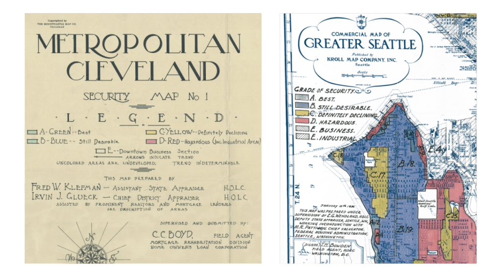
More federal bureaucrats are revealed on the 1936 Greater Seattle HOLC map. Handwriting below the legend reads: “This map was prepared under supervision of E. G. Wendland, HOLC deputy state appraiser, Seattle, WN, working in conjunction with M. R. Pattison, chief valuator, Federal Housing Administration, Seattle, Washington.”[2]
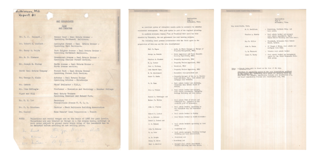
With regard to local private partners, HOLC detailed their participation in city survey reports.[3] In survey reports for Milwaukee County and the Baltimore Area (shown below), HOLC provided the identities and affiliations of local private actors who helped prepare their Residential Security Maps.
The survey report for the 1937 Baltimore Residential Security Map names two federal officials who assisted with creating the map—Dr. Conrad with HOLC and Mr. Lemmon, a chief evaluator with the Federal Housing Administration. Maryland HOLC officials also partnered with real estate brokers from both Baltimore City and Baltimore County. The agency consulted with two real estate firms: Smith Real Estate Company and Piper & Hill. Other local partners included a Goucher College professor, a cashier from the West Baltimore Building Association, and the secretary of the Pennsylvania Avenue Federal Savings and Loan Association.
The survey report for the 1938 Milwaukee County Residential Security Map lists six Wisconsin HOLC officials. These bureaucrats partnered with real estate brokers hailing from several Milwaukee real estate firms, including A. L. Grootomaat & Sons, Inc., Gillis & Pottinger Co., and Zingon & Braun. HOLC also collaborated with the president and chairmen of the Wisconsin Real Estate Board as well as representatives from several banking and financial firms.[4]
Moreover, any examination of HOLC must consider the agency’s position on the government organizational chart. HOLC was a subunit of the Federal Home Loan Bank Board (FHLBB), the agency responsible for disseminating HOLC mapping techniques. In the August 1936 release of the FHLBB’s journal Federal Home Loan Bank Review, the FHLBB published an article entitled “Security Maps for Analysis of Mortgage Lending Areas.” In the article, the FHLBB divulged its central role in embedding redlining into the lending industry:
The practical value of such maps in guiding lending policies and collection policies is being demonstrated to mortgage institutions throughout the country by the Mortgagee Rehabilitation Division of the Federal Home Loan Bank Board. As a result, several hundred institutions which had never previously considered such an approach to their mortgage problems have begun to develop and maintain security maps. They will thus be in a better position than ever before to know what neighborhoods they ought to seek loans and in what neighborhoods they are over loaned.[5]
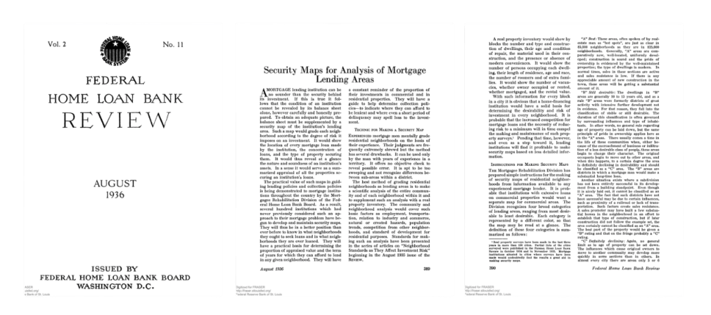
In their journal, the FHLBB openly admitted to operating as the Johnny Appleseed of redlining by sowing their seeds of security maps into the private financial system. The February 1938 issue of The Architectural Forum profiled Corwin Fergus, who led the FHLBB Division of Research and Statistics, and detailed FHLBB’s method of creating security maps.[6] The publication announced to readers: “If you have a good reason, you can get a look at the map of your town by going to Washington.” Additionally, the Forum printed a black-and-white, anonymous version of Lima, Ohio’s HOLC map.
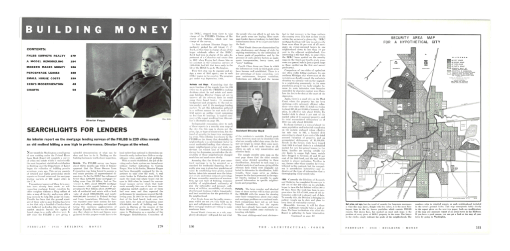
Some scholars have argued HOLC should not bear blame for redlining, since HOLC did not share its maps publicly and it saved homes from foreclosures in redlined neighborhoods.[7] This argument is correct insofar as the FHLBB was responsible for instigating redlining. The Architectural Forum noted that the FHLBB’s Division of Research and Statistics had taken charge of the project.[8] By hosting mapping workshops with “several hundred institutions” and furnishing instructions for drafting security maps, the FHLBB catalyzed and codified redlining into national lending practice using HOLC maps as the model.
FHA Redlining Evidence
But the FHLBB was not alone. The Federal Housing Administration (FHA) would later be more responsible for enforcing and expanding redlining. While the role of HOLC maps have been researched extensively by scholars, the role of FHA maps has scarcely been explored.[9] Fortunately, the National Archives houses a cache of FHA maps in the Cartographic Records of the Federal Housing Administration (Records Group 31). In a folder containing Wisconsin files, I located FHA Neighborhood Ratings Maps for two cities: Racine and Kenosha. The maps (depicted below) were annotated in pencil and dated in 1934.

Both maps identify Homer Hoyt—FHA Chief Land Economist—as ranking neighborhoods for mortgage risk using the familiar color palette consisting of red, yellow, blue, and green. The 1936 FHA Underwriting Manual adds more context. Paragraph 604 details the FHA’s system of grading loans using A, B, C, and D in a manner corresponding to green, blue, yellow, and red.[10] This grading scheme served as the bedrock of FHA’s mortgage insurance program.
Hence, the 1936 FHA Underwriting Manual matched the letter grading system found on HOLC maps, letter-for-letter. Additionally, paragraph four in the 1936 manual noted that the original version of the FHA Underwriting Manual was issued November 1, 1934. When viewed as a whole, cartographic and textual evidence points to FHA officials developing an identical color code and letter grade system for mortgage lending as HOLC before the HOLC City Survey Program produced their first maps in 1936.[11] At the very least, the FHA’s 1934 Neighborhood Rating Maps and 1936 Underwriting Manual indicate that FHA maps explicitly shared the same cartographic logic as the FHLBB.
Given these findings, HOLC Residential Security Maps may have been originally derived or drawn from FHA-inspired thinking. The fact that HOLC maps for Seattle and Baltimore were prepared with the aid of high-level FHA evaluators adds credence to this claim. The 1936 Greater Seattle HOLC map also repeats the legend description for each color on the 1934 FHA maps word-for-word: “best” (green), “still desirable” (blue), “declining” (yellow), and “hazardous” (red).
A second set of FHA maps—Outstanding Commitments Maps—reveal that the agency insured home loans in a spatially racist manner. The Outstanding Commitment Maps for Columbia, SC, and Washington, DC, (both dated in 1936) depict a less colorful—but no less devastating—form of spatial racism compared to HOLC maps. Using a different set of letter codes than found in the 1936 manual, Outstanding Commitment Maps used letters ranging from A through H to denote which neighborhoods were worthy of guaranteeing loans for the building of entire subdivisions.[12]
Outstanding Commitments Maps depicted small circles and rectangles to indicate where the FHA sponsored the building of homes and entire housing subdivisions. FHA redlining can be inferred by noting that while neighborhoods graded A, B, and C feature multiple projects, neighborhoods graded D and F contain few, if any, dots on the 1936 Columbia, South Carolina, FHA map. On the 1936 FHA map of the Washington, DC, metropolitan area, FHA-underwritten projects can be easily found in A, B, and C graded communities, while F and H communities feature very few FHA-sponsored projects.

The “Rosetta Stone” for deciphering FHA’s letter codes is found in the Housing Market Analysis for Washington, DC, printed in July 1937. FHA descriptions for residential sub-areas make it evident that A, B, C, D, and G were codes designated for White communities, while F and H were codes designated for Negro communities.[13]
Morphing Maps and the Quandary of Quantitative Analyses
Clearly then, the FHLBB and FHA deployed maps to direct the flows of capital investment and home building across the nation. However, a key question for research remains: are HOLC maps produced in the 1930s responsible for today’s outcomes, including health, education, pollution, and urban heat islands? In “The Tyranny of the Map,” Gioielli argued that redlining maps “changed significantly over time,” implying that maps produced after 1940 would diminish the impact that HOLC’s maps produced in the 1930s could have on present outcomes. A corollary implication is that maps after the 1930s changed with no discernible pattern. In actuality, the way that redlining maps were updated and revised by the FHA can be discerned. Once this pattern is identified, it can explain how HOLC maps continue to impact outcomes today.
For instance, a 1953 Baltimore housing market analysis reveals how the FHA was obsessed with the “movement of Negroes” into White neighborhoods during the Great Migration.[14] In a section entitled “Movement of Negroes into West and Northwest Baltimore,” FHA analyst Ralph Weese repeatedly referenced the “tremendous movement” and “extensive movement” of Negroes.
This emphasis on Black spatial movements is telling. In the first few decades of the 1900s, the White-owned Baltimore Sun newspaper (and other newspapers around the country) repeatedly blared warnings of an impending “Negro Invasion.”[15] The 1936 version of the FHA Underwriting Manual called special attention to how the movement of “incompatible racial and social groups” would affect real estate values. Paragraph 233 of the manual instructed:
The Valuator should investigate areas surrounding the location to determine whether or not incompatible racial and social groups are present, to the end that an intelligent prediction may be made regarding the possibility or probability of the location being invaded by such groups. If a neighborhood is to retain stability it is necessary that properties shall continue to be occupied by the same racial and social classes. A change in social and racial occupancy generally leads to instability and a reduction in values.[16]
When the FHA referenced “the possibility or probability of the location being invaded” by “incompatible racial and social groups,” it was a direct allusion to White newspapers deploying the racist phrase “Negro Invasion.” Notice, however, that the manual’s phrasing avoids mentioning which specific groups and classes were of most concern to the FHA.
Only towards the end of the manual, in paragraph 1849, subsection B, does the explicit listing of four racial occupancy designations finally appear: White, Mixed, Foreign, and Negro. The only other racial group—beside White—in this list is Negro. Hence, the FHA’s focus when underwriting new home construction was when Negroes might move into a White neighborhood. This focus—shared by most White real estate brokers, assessors, bankers, planners, and homeowners—was the basis for how maps would be updated after 1940.[17]
In fact, the FHA drafted a third set of maps called Block Data Maps to forecast a potential “Negro Invasion.”[18] In the June 1937 issue of the FHA journal Insured Mortgage Portfolio, in article entitled “A New Map Aid for Mortgage Lenders,” the FHA invited mortgage lenders to view the maps.[19] FHA provided a list of their office locations where their maps could be consulted.
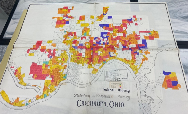
What makes Block Data Maps notable is that they contained eight statistical measures written vertically in nearly every residential block in a city. The eighth number in every block represented “the percentage of the total number of persons living in the block that are of a race other than white.” Two Block Data Maps remove any doubt as to which race captured the interest of the FHA. The eighth number in the legend of the Athens, Georgia, Block Data Map reads “Percent of Total Number of Households Occupied by Negroes,” while the Cincinnati, Ohio, Block Data Map reads “% Units Occupied by Negroes.”
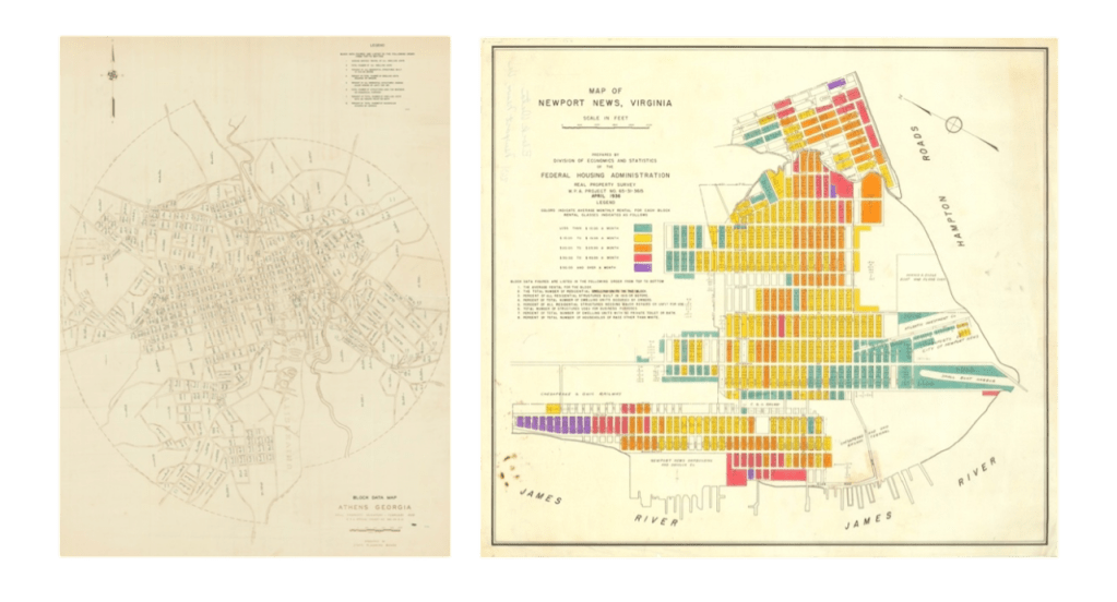
The FHA explained the importance of their Block Data Maps. In the same June 1937 article of the Insured Mortgage Portfolio, the agency remarked:
Block data maps, one of FHA’s new factual aids to mortgage lending, have been described as “magic carpets” for mortgage lenders…they provide much information relating to the probable stability of the neighborhood and the trends which may be taking place there. The mortgage lender considering a loan on a house in a high-priced neighborhood, for instance, can determine the points at which low-priced or substandard structures are nearest, whether there is an admixture of commercial uses, and whether there are inharmonious racial groups in the vicinity.[20]
Here, the FHA informed mortgage lenders that they could use Block Data Maps to geographically track “inharmonious racial groups in the vicinity.” As noted previously, whenever the FHA employed the euphemism “inharmonious racial groups,” it was coded language at the time for Negroes. Block Data Maps were fundamentally FHA Negro-tracking maps.
But the FHA’s machinations did not end with offering mortgage lenders access to their Block Data Maps. The FHA journal provided mortgage lenders with a testimonial of one bank’s experience with preparing and using their own private redlining map. In the February 1938 issue of the Insured Mortgage Portfolio, the FHA uplifted Security-First National Bank of Los Angeles as an exemplar of private redlining. In an article entitled “Measuring the Neighborhood Risk,” L. Elden Smith extolled the FHA for originating and emphasizing the importance of neighborhood ratings: “The Federal Housing Administration has been a pioneer in placing emphasis on the neighborhood influence, as amply illustrated by the weight given this factor in the FHA risk-rating system.”[21]
The FHA journal also printed Security-First National Bank’s government-inspired security map. The bank’s discriminatory map featured a different color scheme compared to HOLC and FHA, but it echoed the essential logic displayed on HOLC’s Residential Security Maps and FHA’s Neighborhood Rating Maps.
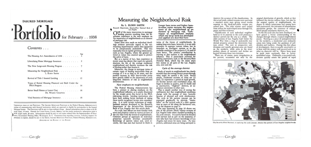
In the bank’s map legend, the labels “Growth,” “Maturity,” “Decline,” and “Decadence” were equivalent to green (A), blue (B), yellow (C), and red (D). Smith explained the bank’s approach to lending:
It is usually easy to recognize the neighborhoods which have reached the last phase of the life cycle. The blighted areas, occupied by the lowest income and social groups, fall into this classification. In Los Angeles, the incursion of inharmonious racial elements has marked this phase in many, although not all cases. Wherever an invasion of this character commences, it can almost be put down as a rule that the newcomers will drive out the original residents. Hence, it is desirable for large lenders to follow racial movements with considerable care.[22]
Thus, when researchers and residents examine redlining today—such as those metropolitan areas shown in research reports published by the National Community Reinvestment Coalition (NCRC)—they are viewing modern maps that depict how capital deprivation followed wherever African Americans moved.[23] The FHA, cities, realtors, assessors, and banks continually tracked Black “racial movements” and then updated their maps to expand redlining into the communities where African Americans started living as a result of the Great Migration, White desegregation resistance and flight, and predatory real estate blockbusting. Even when African Americans and other lower income populations began moving out of redlined neighborhoods, many often landed in yellowlined neighborhoods, blocked by exclusionary barriers in bluelined and greenlined neighborhoods (e.g. zoning, restrictive covenants, racial steering).
Demographic research supports this assertion. Using Historic Redlining Score Quartiles (derived by calculating the percentage of a census tract colored red, yellow, blue, or green by HOLC), NCRC and University of Wisconsin researchers found that in Quartile 1 census tracts (those closest to greenlined neighborhood on HOLC maps), the poverty rate today averages 14.3 percent, and the nonwhite population averages 34.6 percent.[24] By comparison, in Quartile 4 census tracts (those closest to redlined neighborhoods on HOLC maps), the poverty rate today averages 28.1 percent, while the nonwhite population averages 57 percent. Both poverty rates and minority population rates rise in stair-step fashion when moving from green to blue to yellow to red census tracts.
In other words, HOLC color codes in the 1930s predict today’s poverty rates, the percentage of White residents, and various health outcomes in lockstep fashion. Communities colored green or blue by the FHLBB in the 1930s have lower rates of poverty, higher percentages of White residents, and lower rates of chronic diseases today. Alternatively, communities colored yellow and red by FHLBB in the 1930s have higher rates of poverty, lower percentages of White residents, and higher rates of chronic diseases today. In a separate study published in 2018 by NCRC, researchers found that 74 percent of redlined communities remained low to moderate income, while 91 percent of greenlined communities remained middle to upper income today. [25]
Put more simply, many areas redlined by the FHLBB/HOLC in the 1930s remain economically disadvantaged today, while most greenlined neighborhoods retain tremendous structural advantages. Of course, some redlined neighborhoods later gentrified, while a few neighborhoods became redlined and deprived of capital as African Americans moved into those neighborhoods. But the research is clear—the majority of neighborhoods redlined in the 1930s could be described today as still redlined. Conversely, the vast majority of communities that were greenlined in the 1930s retain their economic and structural advantages.
How Local Mechanisms Maintained Redlining
As research reveals, historic redlining endured. Equally as important, but rarely discussed, historic greenlining also endured. Historic greenlining is the structural advantaging and resourcing of wealthy White neighborhoods. Wealthy, greenlined White neighborhoods engaged in what urban scholar Sheryll Cashin describes as “opportunity hoarding,” which perpetuated redlining and intentionally concentrated poverty in Black neighborhoods.[26]
For instance, between 1937 and 1940 the Housing Authority of Baltimore City placed nearly all its first wave of public housing communities in redlined neighborhoods where Black people were forced to live. Meanwhile, no public housing communities were sited in bluelined or greenlined White communities. Later in the 1970s, Baltimore’s US-40 highway was built through the city’s westside’s redlined neighborhoods. By concentrating public housing and highways in redlined communities, White-run city government agencies actively protected and preserved greenlined neighborhoods.[27]
A second local mechanism that explains how the spatial redlining of Black neighborhoods was maintained is the concept of “discursive redlining,” a term coined by scholars Nikki Jones and Christina Jackson.[28] Discursive redlining involves White social avoidance practices based on inaccurate narratives and derisively labeling Black neighborhoods and people as “ghetto.” Media narratives, such as “Negro Invasion,” reinforce policies and practices that continue to defund Black neighborhoods. Armed with stigmatizing narratives, local White institutions colluded to solidify redlining in the 1930s and continued to redline, subprime, marginalize, and demonize Black communities afterwards. When social narratives repeatedly blare “don’t go down there,” then economic entities will refrain from sending resources down there as well.
The third local mechanism that maintained redlining is the entrenched whiteness of key professions. According to a 2019 Appraisal Institute report, out of 78,015 active real estate appraisers in the nation, 85.4 percent identified as White, while a paltry 1.3 percent identified as Black or African American.[29] In terms of real estate agents and brokers, 75.5 percent are White, while only 5.75 percent are Black.[30] Hence, White real estate professionals constitute a supermajority in the field. The same can be said for the professional field that determines the future development of city neighborhoods: urban planners. According to the employment firm Zippia, the urban planning workforce today is 67.4 percent White and only 4.6 percent African American.[31] Take note, however, these are recent data.
Historically speaking, the racial composition of appraisers, brokers, agents, and urban planners was likely 95 percent or more White for decades. To give one example, the National Association of Realtors began allowing Black realtors to join its organization in 1961.[32] Hence, White realtors monopolized the appraising, assessing, and selling of real estate for decades, rooting property values in race-based spatial stratification and neighborhood rankings. At the same time, White urban planners dictated which neighborhoods would be planned for growth and thriving and which neighborhoods would be planned for stagnation and decline. The historic whiteness of these professions helps explain how the redlining of Black neighborhoods and the greenlining of White neighborhoods was actively and intentionally maintained.[33]
How the FHLBB and FHA Maintained Redlining
Although local mechanisms played a powerful role in maintaining redlining, the FHLBB and FHA still rank as the primary culprits for entrenching and expanding redlining after 1940. In the March 1946 issue of the Federal Home Loan Bank Review, the FHLBB parroted the narrative that “the infiltration of lower income families” caused neighborhood decline. The FHLBB shrugged its shoulders at the situation by noting that “the remedy implied is to keep such families out.”[34] The agency feigned as if it were a mere observer, but it possessed regulatory authority over financial institutions, upheld race-based appraisal standards, and actively buttressed and bolstered greenlined neighborhoods.
Starting in 1940, the FHLBB sponsored and the HOLC developed the Waverly Neighborhood Conservation Project in an all-White, greenlined community located in Baltimore City.[35] The FHLBB and HOLC engaged in an area-wide cosmetic home makeover project in all-White Waverly while sponsoring no effort to finance high-quality, subsidized, low-density housing in Baltimore’s redlined communities. The FHLBB also did not oppose racial discrimination as a matter of stated policy until their June 1, 1961, resolution, which offered no remedies.[36]
Gioielli’s core argument is that HOLC maps cannot be a primary culprit of ongoing redlining since HOLC and its officials are long dead and gone. However, it was the FHLBB that commissioned HOLC maps, hosted security map workshops, and supported home improvement programs in greenlined neighborhoods. The FHLBB is alive and well today as the Federal Home Loan Bank System (FHLBS) in the Federal Housing Finance Agency. Hence, the FHLBB/FHLBS is a primary culprit responsible for introducing race-based neighborhood rankings into the financial system and lifting greenlined areas while neither remediating nor repairing the damage it inflicted in redlined areas.
The FHA is the other primary culprit for instituting and intensifying redlining. As Neighborhood Ratings Maps, Block Data Maps, and Outstanding Commitment Maps attest, the FHA deployed maps to rate neighborhoods for mortgage lending, track African American spatial movements, and insure home building in racially segregated subdivisions. The FHA metastasized urban apartheid by providing land planning guidance to suburban developers, underwriting racially segregated subdivisions, and fostering urban sprawl outside cities.[37]
While HOLC and FHA maps differed in color scheme and methods, they featured the same core logic. As urban data scientist Wenfei Xu demonstrated in her work on Chicago, although FHA and FHLBB diverged in grading census tracts in A, B, and C communities, both agreed on the same grading for D communities in 85.6 percent of census tracts.[38] If this high level of grade D agreement existed for other cities, it means FHA would have agreed with HOLC in terms of which communities to color red after 1940. This helps to explain how FHA maps drawn after 1940 would later reify and reinforce the color codes found on HOLC maps produced between 1936 and 1940.
Conclusion
By their own admissions, the FHLBB and FHA instigated and influenced the rise of redlining nationwide. Their admissions rebut Gioielli’s critique of Richard Rothstein’s book The Color of Law. Gioielli argued the book “reinforces a levianthanesque interpretation of redlining as something imposed upon American society by the federal government during the New Deal.” But archival evidence, agency journals, and trade publications corroborate The Color of Law.[39] While local governments, realtors, and newspapers engineered and enforced racial segregation, the federal government was the leviathan that introduced and imposed a wholly new map-based system of color-coded mortgage lending upon the American financial system.
In the 1930s, the federal government devised neighborhood ratings, letter grades, and color codes for Residential Security Maps, Neighborhood Ratings Maps, Outstanding Commitments Maps, and Block Data Maps. After 1940, the FHLBB and FHA crystalized the red, yellow, blue, and green patterns coloring HOLC Residential Security Maps.[40] These maps directed the development of cities and suburbs while underwriting a banking system that allocated capital based on neighborhood racial demographics. Recent statistical studies based on HOLC maps document the cumulative effects of what scholar Noliwe Rooks has coined segrenomics, a system of denying wealth in red neighborhoods while providing affirmative action in green neighborhoods.[41] While ostensibly well-meaning, any suggestion to backpedal from using HOLC maps to provide a clear understanding of America’s segrenomics only undermines the quest for making Black neighborhoods, and thereby Black lives, matter.

Lawrence T. Brown is currently serving as a research scientist in the Center for Urban Health Equity at Morgan State University. His portfolio of work includes conducting public health research and creating GIS mapping/data platforms. He is the author of The Black Butterfly: The Harmful Politics of Race and Space in America, published by Johns Hopkins University Press in January 2021.
Featured image: FHA block data map of Cincinnati, Ohio, between 1932-1938, courtesy of NARA.
[1] The 1936 Metropolitan Cleveland map can be found on The Ohio State University’s University Libraries webpage entitled “Maps: Resources Related to Finding Information Resources for Maps and Cartography,” https://guides.osu.edu/maps/redlining.
[2] Other HOLC maps list people involved in drafting them. The undated Port Arthur, Texas, HOLC map features the names of three “real estate men” who helped designate the color codes on that map. Map found on the Mapping Inequality website. The 1935 Portland, Maine, HOLC map—hosted on the Maine Memory Network website—features the names of a HOLC field agent, the HOLC state appraiser, the president of Maine Realty, and the secretary of the Federal Loan and Building Association.
[3] Both HOLC Residential Security Maps and city survey reports are located in the City Survey Files in the Textual Records section (Record Group 195) of the National Archives II in College Park, Maryland.
[4] These include Integrity Savings Building and Loan Association, Sterling Savings Building and Loan Association, Welfare Building and Loan Association, Northern Building and Loan Association, Upper Third Street Building and Loan Association, and First Wisconsin National Bank Group.
[5] Federal Home Loan Bank Board, “Security Maps for Analysis of Mortgage Lending Areas,” Federal Home Loan Bank Review 2, no. 11 (August 1936): 389-391. See second paragraph on page 389.
[6] “FHLBB Surveys Realty,” The Architectural Forum, 68, no. 2 (February 1938): 179-183.
[7] Price Fishback, Jonathan Rose, Ken Snowden, and Thomas Storrs, 2022. “New Evidence on Redlining by Federal Housing Programs in the 1930s,” Working Paper No. 2022-01, Federal Reserve Bank of Chicago, January 2022, https://www.chicagofed.org/publications/working-papers/2022/2022-01. See Conclusion, p. 26.
[8] See top of page 180. Also see: Amy Hiller, “Residential Security Maps and Neighborhood Appraisals: The Homeowners’ Loan Corporation and the Case of Philadelphia,” Social Science History 29, no. 2 (2005): 207-233. According to Hiller on page 214: “In September 1935, the board [FHLBB] assigned responsibility for the surveys to the Mortgagee Rehabilitation Committee, which it consolidated into the Division of Research and Statistics in September 1936.”
[9] While Kenneth T. Jackson received acclaim for locating and identifying redlining on HOLC Residential Security Maps, he also located and identified redlining on FHA maps in his pioneering book Crabgrass Frontier: The Suburbanization of the United States (Oxford University Press, 1985). Jackson discussed FHA redlining on pages 203-218.
[10] A physical copy of the FHA Underwriting Manual is housed in the University of Wyoming’s American Heritage Center in the Frederick Morrison Babcock Papers, Accession Number 08586, Box 7. It can be downloaded and viewed from their Digital Collections.
[11] Todd Michney., “How the City Survey’s Redlining Maps Were Made: A Closer Look at HOLC’s Mortgagee Rehabilitation Division,” Journal of Planning History 21, no. 4 (2022): 316-344. See page 319.
[12] Sarah Shoenfeld, “Mapping Segregation in DC,” DC Policy Center, April 23, 2019, https://www.dcpolicycenter.org/publications/mapping-segregation-fha/. I located the Columbia, SC, FHA map during a visit to the National Archives in the Cartographic Section (Record Group 31).
[13] Housing Market Analysis, Washington DC, (Washington, DC: Federal Housing Administration, July 1937), National Archives II, College Park, MD, Record Group 31 in Textual Records. See pages 17-25.
[14] Ralph S. Weese, Analysis of the Baltimore Housing Market as of September 1, 1953 (Washington, DC: FHA, 1953), National Archives II, FHA Textual Records, Record Group 31. See page 37.
[15] Lawrence T. Brown, The Black Butterfly: The Harmful Politics of Race and Space in America, (Baltimore, MD: Johns Hopkins University Press, 2021). See pages 64-86.
[16] Federal Housing Administration, Underwriting Manual: Underwriting and Valuation Procedure Under Title II of the National Housing Act (Washington, DC: FHA, 1936 revision).
[17] For scholarly accounts on the racialization of space and discrimination by race in finance see Keeanga-Yamahtta Taylor’s book Race for Profit: How Banks and the Real Estate Industry Undermined Black Home Ownership (2019), Elizabeth Korver-Glenn’s book Race Brokers: Housing Markets and Segregation in the 21st Century (2021), and Emily Flitter’s book The White Wall: How Big Finance Bankrupts Black America (2022).
[18] FHA partnered with the Works Progress Administration (WPA) to produce Block Data Maps. WPA workers administered Real Property Surveys to collect the data. WPA also printed maps. See April 23, 1939 article in the Tampa Bay Times (St. Petersburg, FL) entitled “22 Real-Property Surveys Being Conducted” on page 33, top of column 6. Also see the January 2, 1939 edition of The Register-Guard (Eugene, OR) entitled “Surveys of Local Real Property in Great Demand” on page 8, top of column 7.
[19] James S. Taylor, “A New Map Aid for Mortgage Lenders,” Insured Mortgage Portfolio, June 1937. See page 10. Article is on pages 8-10 and 22. On the table of contents page for the issue, it reads: “The Insured Mortgage Portfolio is the Federal Housing Administration’s medium of communication with financial institutions which are approved or eligible participation the Insured Mortgage System.”
[20] James S. Taylor, “A New Map Aid for Mortgage Lenders,” 8-9.
[21] L. Elden Smith, “Measuring the Neighborhood Risk,” Insured Mortgage Portfolio, February 1938. Quote is on page 9. The map is on page 10. Article starts on pages 9-11 and concludes on pages 22-23.
[22] James S. Taylor, “A New Map Aid for Mortgage Lenders,” quote is on page 22.
[23] The National Community Reinvestment Coalition has published research reports revealing modern redlining in Baltimore; St. Louis, Milwaukee, Minneapolis, and St. Paul; and Washington DC.
[24] Jason Richardson, Bruce Mitchell, Jad Edlebi, Helen C.S. Meier, and Emily Lynch, The Lasting Impact of Historic “Redlining’ on Neighborhood Health: Higher Prevalence of COVID-19 Risk Factors (Washington, DC: National Community Reinvestment Coalition, 2020).
[25] Bruce Mitchell and Juan Franco, HOLC “Redlining” Maps: The Persistent Structure of Segregation and Economic Inequality (Washington, DC: National Community Reinvestment Coalition, 2018).
[26] Sheryll Cashin, White Space, Black Hood: Opportunity Hoarding and Segregation in the Age of Inequality (Boston, MA: Beacon Press, 2022). For an empirical analysis of “municipal redlining” that cities and counties deployed from 1900 to 1940, see Chapter 5 (pages 98-118) in Jessica Trounstine’s book Segregation by Design: Local Politics and Inequality in American Cities (2018).
[27] Karl Taeuber, “Public Housing and Racial Segregation in Baltimore, 1900–1968,” (2003) Thompson v. HUD Court Files, Maryland ACLU, Plaintiff’s Exhibit No. 2, Case Number MJG 95-309, University of Baltimore, Langsdale Library, Special Collections. For a discussion of how public housing was sited in Black neighborhoods in Chicago see Arnold Hirsch’s Making the Second Ghetto: Race & Housing in Chicago 1940-1960, pages 223-226 in the 1998 edition. For a discussion of how highways were constructed in and run through Black neighborhoods nationally, read chapter 8 (pages 95-111) of Interstate: Highway Politics and Policy Since 1939 by Mark H. Rose and Raymond A. Mohl.
[28] Nikki Jones and Christina Jackson, “‘You Just Don’t Go Down There’: Learning to Avoid the Ghetto in San Francisco,” in The Ghetto: Contemporary Global Issues and Controversies, ed. Ray Hutchinson, (Routledge, 2019). See pages 85–86.
[29] The report was entitled U.S. Valuation Profession Fact Sheet: Q1 2019. According to the Appraisal Institute’s report: “The Appraisal Institute was established when the American Institute of Real Estate Appraisers (AIREA) and the Society of Real Estate Appraisers (Society) unified in January 1991. AIREA and the Society, founded in 1932 and 1935, respectively…” Hence, today’s professional real estate appraisal system was born during the same period that redlining was codified in the mid-1930s.
[30] Data USA, Real Estate Brokers & Sales Agents, accessed June 12, 2023.
[31] Zippia, Urban Planner Demographics and Statistics in the US, Accessed June 12, 2023.
[32] Colette Coleman, “Selling Houses While Black,” New York Times, January 12, 2023.
[33] Acknowledging the historic whiteness of these professions and professional associations is another way that scholars can address Gioielli’s excellent point about not letting local actors off the hook.
[34] See page 172 of March 1946 Federal Home Loan Bank Review. Quote from last paragraph in first column. Also see: Louis Lee Woods II, “The Federal Home Loan Bank Board, Redlining, and the National Proliferation of Racial Lending Discrimination, 1921–1950,” Journal of Urban History 38, no. 6(2012): 1036-1059.
[35] Federal Home Loan Bank Board, “Neighborhood Conservation,” Federal Home Loan Bank Review 12, no. 6 (March 1948): 171-175. Also see Waverly in the June, July, and August 1940 issues of The Review.
[36] United States Commission on Civil Rights, Housing: 1961 Commission on Civil Rights Report (Washington, DC: Government Printing Office, 1961). See pages 36-39.
[37] Federal Housing Administration, Planning Profitable Neighborhoods: Technical Bulletin No. 7. (Washington, DC: US Government Printing Office, 1938). Also see: Kenneth Jackson. Crabgrass Frontier: The Suburbanization of the United States. (Cambridge: Oxford University Press, 1987 ed.), 203-218.
[38] Wenfei Xu, “Legacies of Institutionalized Redlining: A Comparison Between Speculative and Implemented Mortgage Risk Maps in Chicago, Illinois,” Housing Policy Debate 32, no.2 (20222): 249-274.
[39] The evidence supports Rothstein’s account, especially in Chapter 4, where he discusses the roles of HOLC and FHA, and in Chapter 7 (section III), where he discusses the role of the FHLBB. Also, Rothstein does highlight the role of local actors. He devoted two entire chapters to local actors, including Chapter 3 Racial Zoning (which took place at the local level) and Chapter 8 Local Tactics.
[40] The evidence in this essay also clarifies recent scholarship by Price Fishback and colleagues. See: Price Fishback, Jonathan Rose, Ken Snowden, and Thomas Storrs, 2022. “New Evidence on Redlining by Federal Housing Programs in the 1930s,” Working Paper No. 2022-01, Federal Reserve Bank of Chicago, January 2022, https://www.chicagofed.org/publications/working-papers/2022/2022-01. On one hand, FHA maps substantiate their point that the FHA “crafted and implemented its own redlining methodology prior to when the HOLC’s mapmaking project began” (p. 3) and used block-level data unlike HOLC (p. 3-4).
But on the other hand, the evidence explains why HOLC maps nevertheless remain influential with regards to recent empirical research. In contrast to Fishback and colleagues’ remark that “The HOLC actively worked to keep the maps and reports out of the hands of people outside of government” (p. 26), the Federal Home Loan Bank Review revealed the FHLBB offered workshops teaching their mapmaking techniques to lenders and The Architectural Forum published their map to a wider audience.
[41] Noliwe Rooks, Cutting School: The Segrenomics of American Education (New York: The New Press, 2020).

One thought on “Pair HOLC Maps with FHA Maps to Tell a More Complete Story”